

Case study
Lily & Linnéa.
A UX design project for a responsive flower ordering website
Scroll ↓
PROJECT OVERVIEW.
-
The problem.
Flower enthusiasts feel a lack of control when they purchase flowers online. The lack of control stems from not being able to physically pick out the flowers themselves and by not knowing whether they are making a sustainable purchase decision or not.
-
The goal.
To design a responsive website where users can easily order sustainable flowers with the option of deciding how they want them to arrive.
-
The product.
Lily & Linnéa is an online flower ordering site that delivers flowers crafted by local florists across the UK. Lily & Linnéa’s target audience is flower enthusiasts who want to brighten up their, or their loved ones’, everyday life with meaningful flowers.
-
My role.
This project was part of my portfolio project for the ‘Google User Experience Design’ course. I was responsible for all parts of this project.
-
My responsibilities.
User research, Ideation, Information architecture, Wireframing, Prototyping & Testing
-
Project duration.
December 2021-January 2022
Understanding the user.
User research | User journey maps | Personas & problem statements
User research.
I conducted 5 interviews to better understand the users I’m designing for and their needs. A primary user group identified by research as individuals who like to shop or browse flowers at least bi-monthly. The goal of the user interviews was to understand the challenges people face when ordering flowers online.
This user group confirmed initial assumptions that they want to feel in control when purchasing flowers. Each flower is unique, and without the physical shopping experience, users feel like they don’t know what they’re buying. The research also revealed other factors such as the importance of sustainability credentials on the website and the need for a smooth check out experience.
Sample of questions asked during the interviews
“Can you describe the process you're currently going through when you buy flowers online?”
“How often do you buy flowers online? When you do, what are you looking for?”
“Is there a way in which this process could work better for you?”
User pain points.
Customisation.
Flower enthusiasts feel a lack of control when buying flowers online. The lack of control stems from not being able to physically pick the flowers themselves.
Sustainability.
The users are ethically conscious and they want reassurance that the company represents their values, including sustainability and supporting local businesses.
Information architecture.
Whether buying flowers for themselves or others, users want clear, simple categories which will help direct them to the right products. Users mentioned that they don’t want to spend too much time browsing around.
Personal experience.
Users want a way to buy flowers that provides meaning to the receiver. They want to know more about the product they’re purchasing and doesn’t just want it to feel like ‘an Amazon of flowers’.
Personas.

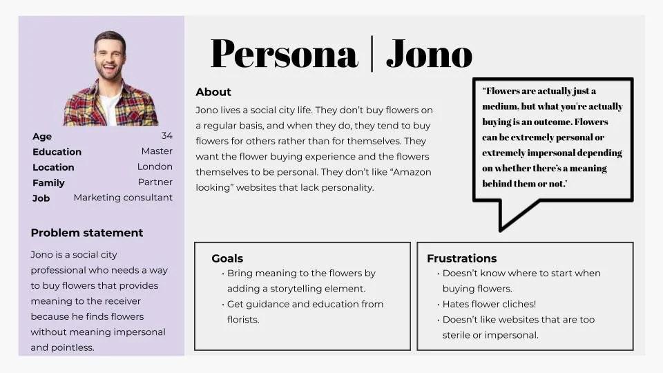
USER JOURNEY.
User journey based on Jen’s persona.

Starting the design.
Sitemap | Paper wireframes | Digital wireframes | Low-fidelity prototype | Usability studies
Sitemap.
The user research indicated that users wanted to see clear, simple categories which will help users find what they’re looking for quickly. The filtering options and the search functionality enables users to narrow down their searches within the category pages.

Paper wireframes.

It was essential to include the following elements on the homepage
Header & footer
Navigation menu
Carousel with CTA’s to category pages
I also wanted to ensure that users would get reassurance by featuring information about the company and the brand values. experts and information about the ingredients.
To the right, you can see the paper wireframes, and the stars indicate the elements that made it to the final version.

Because Lily & Linnéa’s customers will access the site from different devices, I decided to design wireframes for additional screen sizes. This is to ensure that the site will be fully responsive.

Digital wireframes.
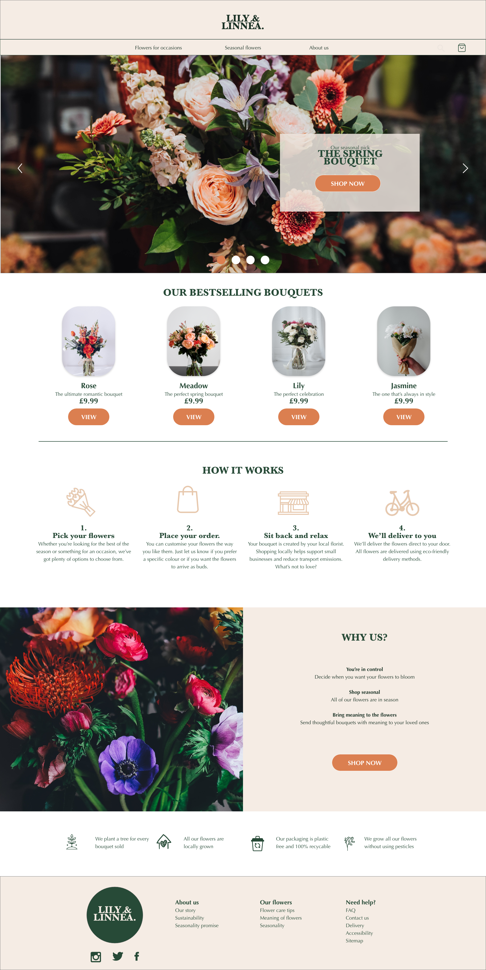
Home screen.
The user research showed that users are looking for an easy, yet personal, way of buying flowers. The wireframe shows the simplicity of the navigation menu which has been designed to give users quick access to the category pages.
The category pages can also be accessible either by the CTA in the main carousel or in the footer links. There is also an option to explore the most popular bouquets for users who might want to get inspired. This is also designed to increase engagement.

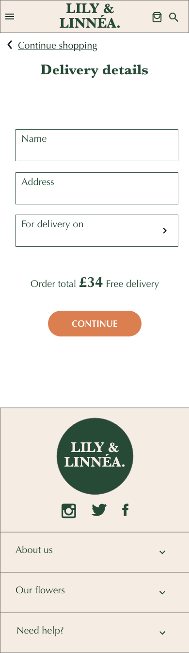
Product page.
The users pointed out that they wanted simple customisation options, which were added to the product pages. There’s page also provides users with information about the meaning of the flowers inside the bouquet.
Clear CTAs allow the users to quickly add a product to their cart.

Usability study.
I created a low-fidelity prototype that I tested on 5 participants in a moderated usability study. The aim of the study was to find out if users can complete the core tasks without any obstructions and challenges. The tasks involve finding, customising and purchasing a flower bouquet.
Findings from the usability study.
-
Informational content.
Users wanted more information about brand values. They also wanted more contextual content on the category and product pages as well as information on how the ordering process work.
-
Clickable filter options.
The clickable element around the filter options needs to cover a bigger area. Users should be able to click on both the filter name and the number indicating the available products listed under each filter.
-
Navigation.
Users need to be able to go back to the shopping pages once they have added something to the cart, and on every page after that.
Refining the design.
Mockups | High-fidelity prototype | Accessibility
Mockups.
Here are the mockups for the product page before and after the usability study.
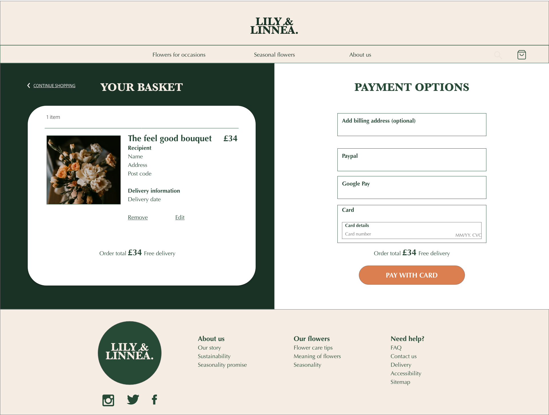
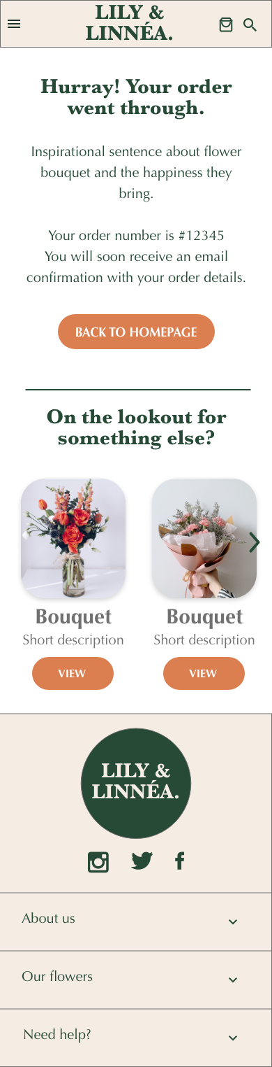
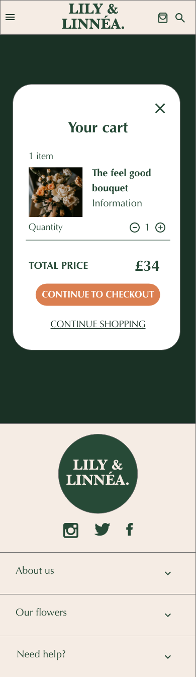
‘Added to cart’ page
To allow users to go back and add more items once they’ve added an item to the cart, I added a clearer CTA link where users have the option to click ‘continue shopping’. This was added as an additional option to the existing ‘X’ button of the lo-fi prototype after it was pointed out in the usability study.

‘About us’ information.
Based on the insights from the usability study, I added more information about the brand’s core values as well as more contextual content around ‘how it works’. The content was added to both the homepage and the product pages.

Product pages.
Another piece of feedback that came up during the usability study was that users expected the clickable element around the filter options to cover a bigger area. During the study, a number of users tried to click on the number indicating the available products listed under each filter instead of the filter name. This caused confusion, so the final prototype allows users to click on both the filter option and the number.

Final Mockups.


High-fidelity prototype.
My hi-fi prototype follows roughly the same flow as the lo-fi prototype. However, a few changes were made at the back of feedback coming out from a usability study, including a simpler way of exiting the checkout process (by adding a “continue shopping’ link.

Accessibility considerations.
-
1.
I used appropriate headings throughout in order to highlight the hierarchy. In addition to that, I also ensured that the font size are in line with the WCAG standards.
-
2.
I used high contrast colour combinations to ensure that the text is easy to read.
-
3.
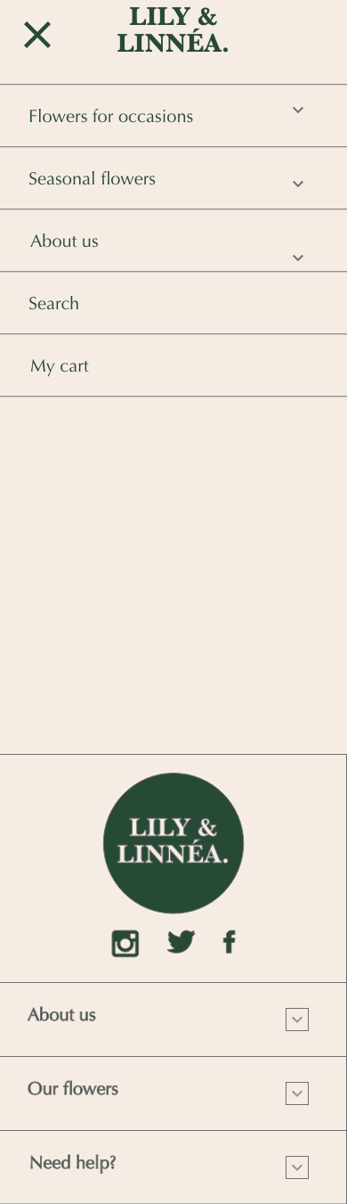
I have added alternative options to gestures used when needed for the mobile version of the prototype (e.g. there are options to swipe and click in the carousel introduction to enable users with limited mobility to flick through easily).
Going forward.
Takeaways | Next steps
TakEaways.
IMPACT.
The primary user group highlighted the simplicity of the design and especially the checkout process.
The users mentioned that they felt in control when putting an order in and that the overall experience was enjoyable.
WHAT I LEARNED.
I learned that designing a responsive website requires more thinking and strategising early on in the design process. I also learned to use design systems in Adobe XD, which helped me massively during this project.
Next steps.
-
Conduct another round of usability studies to validate whether the pain points has been efficiently addressed in the design.
-
Add more screens (such as an ‘about us’ page and search function) that will bring the flow to life even further.
-
Conduct further usability studies for this website across different devices.
Thank you.
If you want to hear more about this project, or if you just want to chat, please feel free to contact me.