

Case study
Size Me App
An app designed to help women find clothes that fit.
Scroll ↓
What is 'Size me App?"‘
‘Size me app’ is a product designed to make it easier for women to find clothes that fit. By using data, the app is designed to create a personalised size profile that can be adapted across different brands.
The app is designed to celebrate different types of bodies and aims to challenge the insecurity that women tend to feel when they don’t fit into clothes.

Project Overview
The problem
Finding clothes that fit can be hard, disappointing and time-consuming.
It’s as much of a business problem as it is a consumer problem. As much as 20% of online-bought products are returned, which is 11% higher than what the return rates would be from items bought in physical stores.
As much as 72% of fashion items are returned for reasons such as size, fit and style. Many of these returns could be prevented.
The goal
To design an app that can help customers find the clothing they’re looking for in the right size.

My role
This case study is built from a design brief from the UX challenge. I took on this project in order to document my end-to-end design process.
My responsibilities
User research, ideation, information architecture, wireframing, prototyping & testing.
Project duration
April 2022
Understanding the user
User research | Personas & problem statements | User journey maps
User research
I carried out 5 user interviews UX research in order to better understand user behaviours, needs, and motivations of the users I was designing for. The goal of the user research was to pinpoint the challenges and motivations that people face when they purchase clothing items online.
In addition, I supported my primary user research with secondary data to understand the wider consumer behaviours that impact customer’s decisions.
The user research uncovered some clear pain points that users face when they buy items online including inconsistency in sizing between brands, measurement difficulties and the fact that only big brands offer free returns which limits the options.
Sample of questions asked during the interviews
“Tell me about the last time you tried to buy clothing online”
“What is the biggest pain point related to buying clothes online?”
“Can you describe a situation in which you’ve bought an item of clothing where it didn’t fit.” “How did that make you feel?”
Empathy map

User pain points
Inconsistent sizing between brands
Users mentioned that sizes and fits vary massively between brands, which makes it hard to know what clothes will fit.
For that reason, they tend to avoid buying clothes from brands they’re not familiar with.
Inadequate sizing guides
Users pointed out that, though there are guides on how to measure their bodies to better choose the right size, it’s hard to measure by themselves.
In addition, a lot of brands don’t put the measurements up and the units vary between brands depending on location.
Only big brands offer free returns
Another point that the users made during the research are that they only feel comfortable buying from brands that offer free returns. This limits their options to bigger brands, though they often want to support smaller, independent brands.
“Brands often have their own size guides, but it’s annoying to have to measure myself before buying something from a brand I haven’t bought from before”
— PARTICIPANT “B” FROM THE USER INTERVIEWS
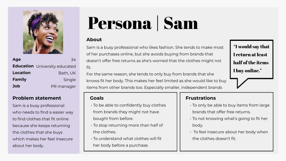
Persona
‘How might We’
I used the ‘how might we’ design thinking exercise in order to try and translate challenges into opportunities.
Problem statement
Sam is a busy professional who needs to find an easier way to find clothes that fit online because she keeps returning the clothes that she buys which makes her feel insecure about her body.
Potential solutions
“How might we design a tool that makes our users feel confident when buying clothes from brands they’ve never bought from before?”
“How might we create an enjoyable sizing guide experience that will make users like their bodies”?
“How might we design a shopping experience where the clothes will fit a user’s body instead of a body fitting into the clothes?”
Starting the design
Digital wireframes | Low-fidelity prototype | Usability studies
Digital wireframes
The user research showed that one of the main pain points is that sizes differ considerably between brands.
Users would therefore want to be able to find the correct size for each individual brand.
The design shows the main brand library in which users can easily find the brands they’re looking for by either clicking on the featured brands or by searching using the search bar.

Brand library for clothes fitting app | Digital wireframes
The users pointed out that they find it frustrating when the size units vary between brands. The design has taken this into consideration by translating each size into other units.

Wireframe of the personalised size profile
Low-Fidelity prototype
The low-fidelity prototype shows the user flow for a new user completing the task of signing up to the app and searching through the brand library for their size.

Usability study
These were the main findings uncovered by the usability study.
-
Visible measurement instructions
Users need the measurement instructions to be visible and accessible. This is an essential step in order to complete the user journey.
-
Confusing Design elements.
Users experienced confusion to certain elements that looked clickable due to the design.
-
More context.
Users pointed out that some of the screens would be improved with additional contextual copy.
Refining the design
Mockups | High-fidelity prototype | Accessibility
Mockups
Users pointed out that the link to the video instructions wasn’t visible enough on the first mockup.
I, therefore, added more emphasis to the instruction CTA to grab users’ attention. I also moved the CTA higher up on the page and added a video icon to indicate that it’s a video.

Findings from the usability study suggested that users wanted to see more context to the size profile. I added additional copy explaining what the data was taken from.
In addition, I also changed the design of the page to highlight the size information further.

Users pointed out that the sizing guide was slightly confusing and that the information circles looked like clickable elements.
I therefore removed the drop shadow to make it look more static as well as added more context to what the information can be used for.

Final mockups


High-Fidelity prototype
The high-fidelity prototype shows the journey of a new user of the app.
The new user will start the flow by going through the product information screens before moving ahead to the user sign up/sign in and the onboarding.
Once the onboarding is completed, they will be presented with a personalised size profile. They have the option to explore the brand library where they can explore their sizes across 10,000 brands.

Accessibility considerations
I provide alternative gestures to enable users with limited mobility to use the app as smoothly as possible.
The colour scheme has been created following the colour contrast recommendations from WCAG. The font size is also in line with accessibility best practices.
Going forward
Takeaways | Next steps
Takeaways
IMPACT
Users mentioned that this app could help them improve their online shopping experience. They particularly liked the brand library feature.
Users also pointed out that they like the design which inspires body positivity.
WHAT I LEARNED
When designing the ‘Size me app’ app, I learned the importance of multiple user studies. Most of the iterations were made in the later stages of the user studies.
Next steps
-
Conduct additional user studies.
-
Conduct more user research to assess if there are additional user needs to address.
-
Add additional functions to the app.
Thank you
If you're interested in this project and what to hear more, or just want to chat, feel free to contact me.