
CASE STUDY
Rewin
A UX design project for a recycling app and responsive website
Scroll ↓

Tools
Adobe XD

Responsibilities
User research, ideation, information architecture, wireframing, prototyping & user testing

Project Duration
March 2022
Project overview

The problem
76% of us struggle to understand recycling labels, Many people don’t recycle for that reason. Another reason why people choose not to recycle is the lack of societal incentives to recycle.

The goal
To design a product that encourages people to recycle more items by offering rewards and highlighting the recycling impact.

The product
Rewin’s objective is to make recycling fun, simple and rewarding. The main product is an app that helps users recycle items while earning rewards.
Understanding the user
User research | Personas & problem statements
I conducted 5 user interviews with users who regularly recycle their household items,
The goal was to understand the challenges people face when recycling. I also wanted to find out what would motivate people to recycle more.
Sample of questions asked during the interviews
“Can you describe the process you're currently going through when recycling items at home?”
“What reasons would discourage you from recycling?”
“What would encourage you to recycle more?”
User research
User pain points
Confusing recycling labels
Recycling labels are confusing, inconsistent and hard to interpret.
Lack of incentive
There is no incentive to recycle. This decreases motivation.
A feeling of hopelessness
There is a general feeling of not making enough impact.
“I’m making a lot of effort, but when I read the news related to the environment, I feel like my contribution doesn’t even matter”.
— PARTICIPANT “C” FROM THE USER INTERVIEWS
Personas


Competitive audit
The competitive audit looked at the closest direct and indirect competitors on the market today including Olio, Scrapp and Horizon Recycling.
The aim of the audit was to spot gaps and opportunities that could inform the design of the product.
Starting the design
Paper wireframes | Digital wireframes | Low-fidelity prototype | Usability studies
Ideation
I did a crazy eight exercise to come up with initial ideas.
Looking at the gaps from the competitive audit, I knew I wanted to make the recycling button as central and easy to access as possible to give users an option to recycle on the go. I also wanted to include rewards and impacts data, as well as some educational elements to encourage positive behaviour.
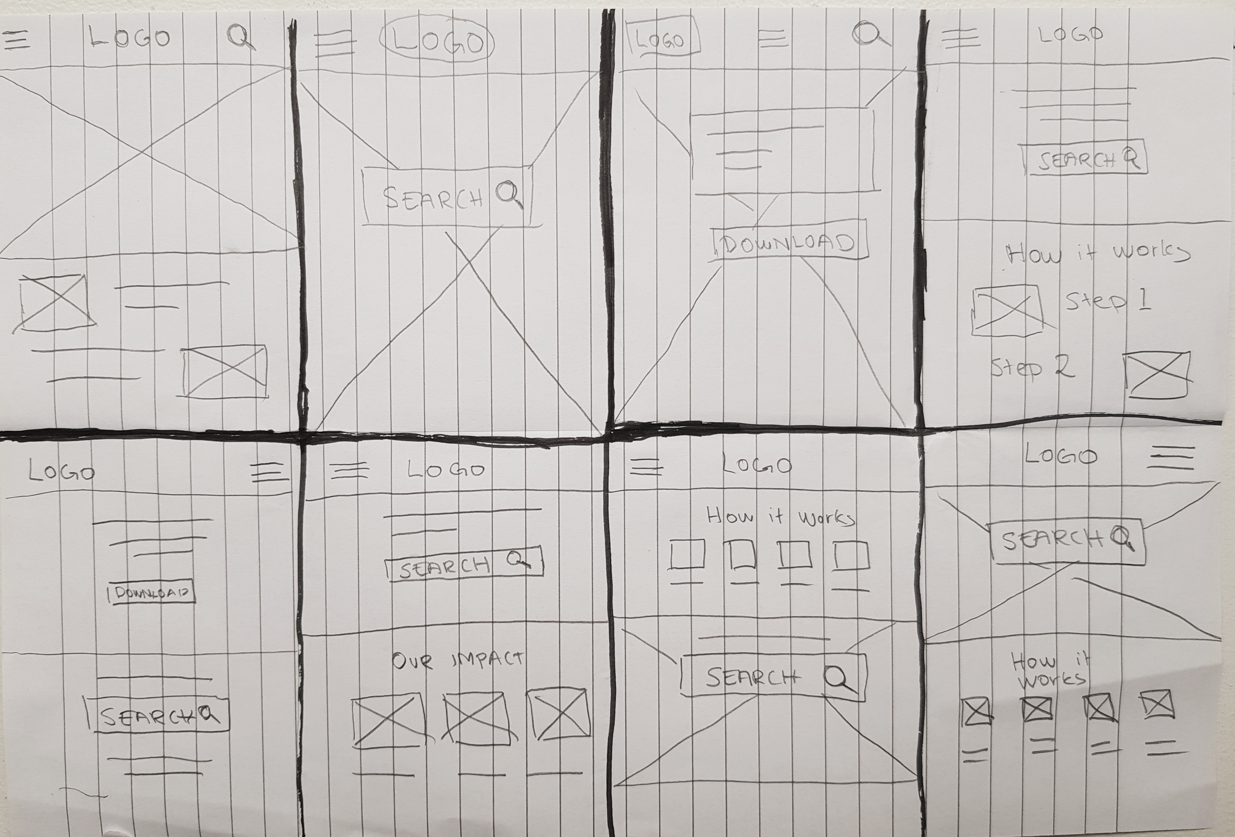
Paper wireframes
Below, you can see the first paper wireframes for the first screens of the app.

Digital wireframes
The user research showed that users are looking for a simple and rewarding way of recycling.

Different impact data will be visible for new vs returning users. For new users, the data will focus on community efforts, whereas returning users will be presented with their collected recycling efforts.
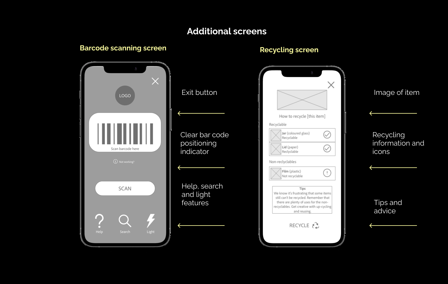
The users pointed out that they wanted a simple way of getting recycling information on the go. The barcode feature enables users to quickly search for an item by scanning a barcode.
Low-Fidelity prototype
My low-fidelity prototype is built around the primary task flow of recycling an item.
The secondary task flow is enabling the user to explore the impacts page, go to the rewards page and claim a reward. The users also have access to the learn section in which they can read engaging articles in an app-friendly ‘story format’ related to the topic.
Main findings from the usability study
#1
People want to see the effect of their recycling efforts and see what others are doing to feel a sense of belonging.
Encouragement & community
#2
Users want to see alternatives to what to do with the items that can’t be recycled (e.g. upcycling, reusing).
Alternatives for non-recyclables
#3
The users want to see a clear CTA on the homescreen to complete the main action of recycling an item.
Clear CTAs on homescreen
Refining the design
Mockups | High-fidelity prototype | Accessibility
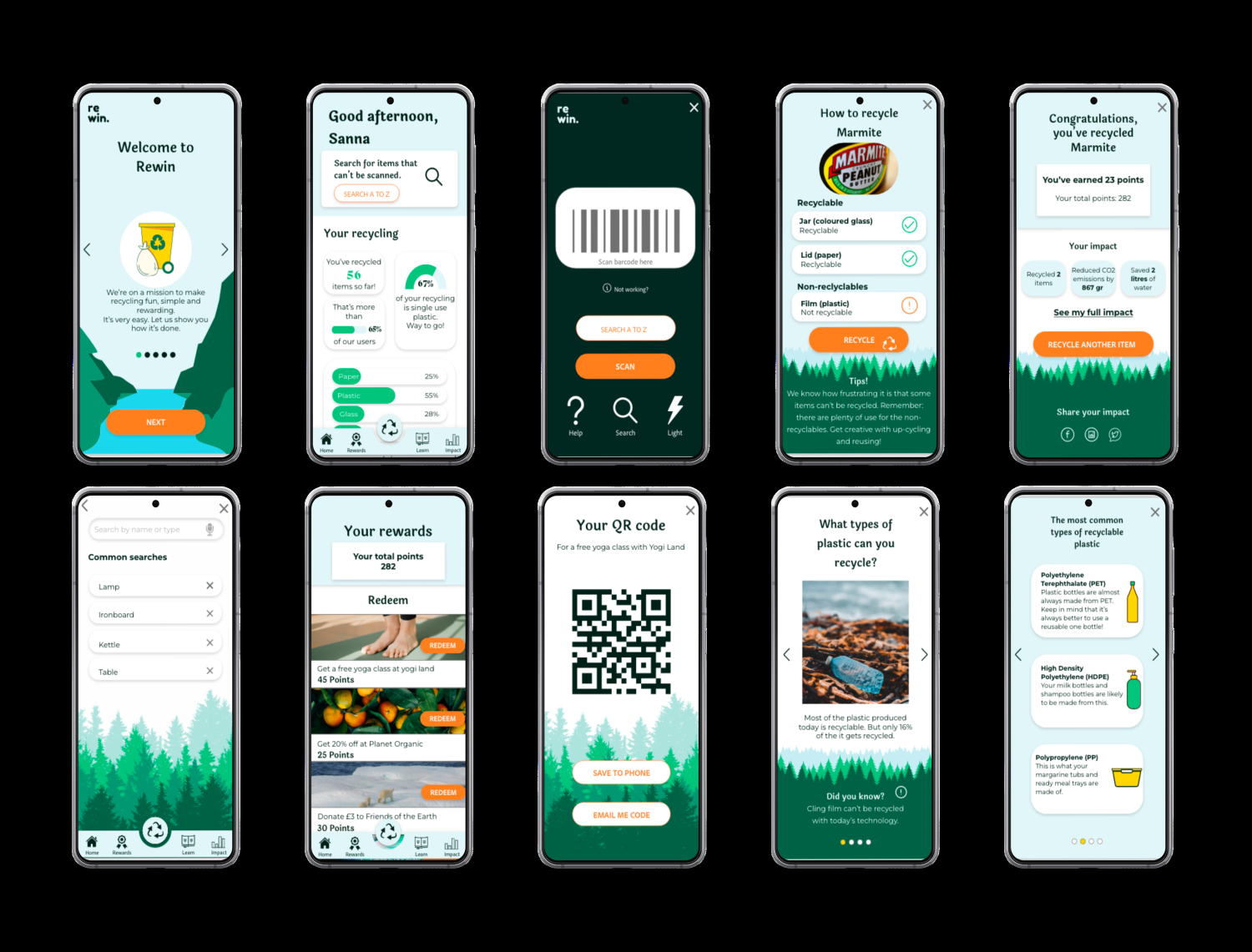
Mockups
Users mentioned that they wanted to compare their impact with the average user to increase motivation and feel a sense of community.

I also emphasised the CTA for the rewards section further in order to make it a more natural next step of the user journey.

Mockups for app
Accessibility considerations
I used standard gestures throughout the app. In addition, there are alternative options to gestures (e.g. there are options to swipe and click in the carousel to enable users with limited mobility to flick through easily).
I used high-contrast colour combinations and recommended font size of 16pt in the app to ensure that the text is easy to read.
Hi-Fi prototype
My Hi-Fi prototype follows the same flow as the lo-fi prototype. The changes have been made on the back of the feedback of the usability studies (e.g. clearer CTA’s, more content related to community impact).
Responsive website
Sitemap | Information architecture | Responsive design
Sitemap
Once the app was developed, I created a sitemap for the responsive website.
The user research indicated that users wanted simple categories which will help them find what they were looking for quickly. The recycling search options enable users to search for items to recycle using search alternatives rather than a barcode.

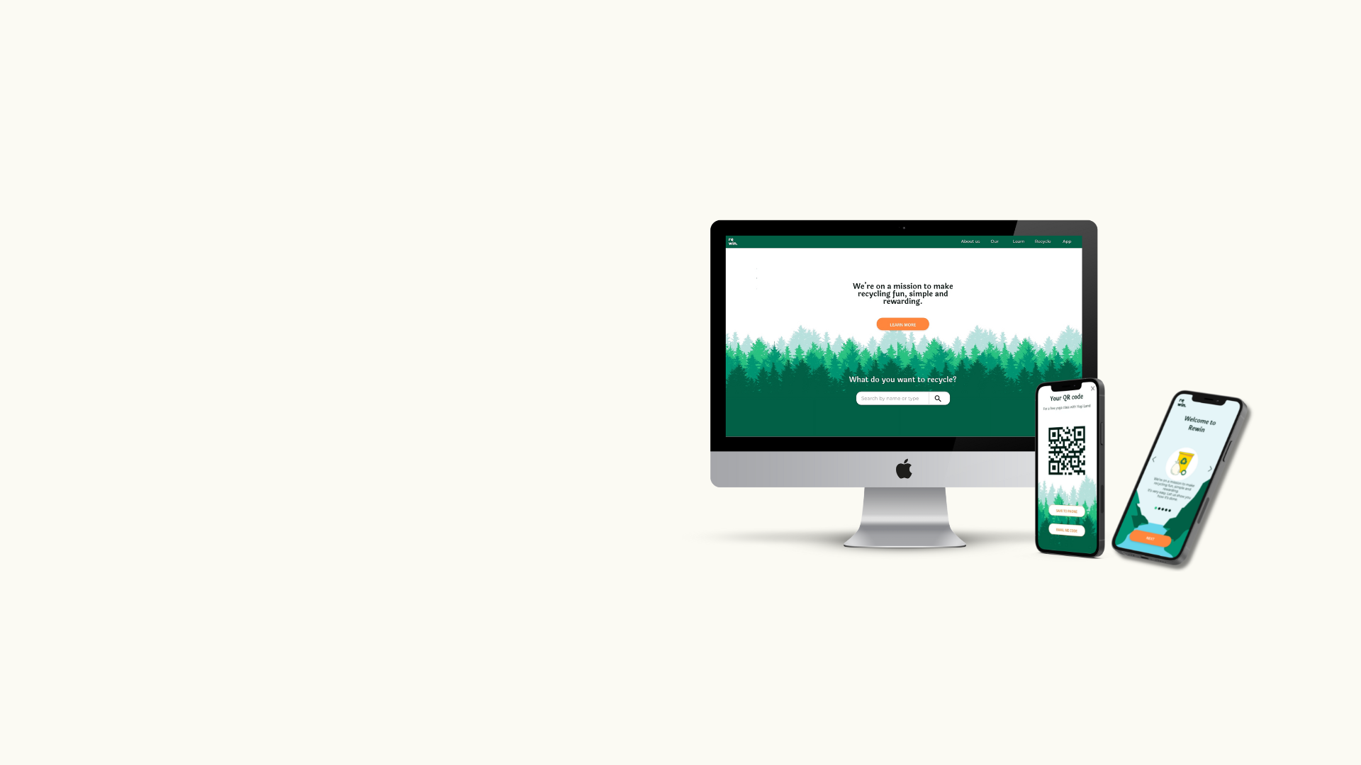
Mockups for responsive website
The responsive designs consisted of mobile, tablet and desktop versions. I optimised each version to fit the user's needs for each device.
For the website, the main user needs were to educate users about the mission and explain how the app works. The website also had a search function in which people can find information about how to recycle items, but no barcode search functionality like the app has.

Mockups for mobile site

Mockups for desktop

Going forward
Takeaways | Next steps
Takeaways
IMPACT
The users mentioned that the app and website it something that they can see themselves use in their day-to-day life.
The barcode feature was especially praised as it’s easily accessible when a user is on the go using their mobile. It’s was mentioned it’s easy to bring out and use even when someone is cooking for instance.
WHAT I LEARNED
I learned that designing an app and a responsive website requires more thinking and strategising early on in the research and design phase.
I also learnt the importance of putting the use cases in the forefront of the design from start and adapting the design on the back of the different needs for each device.
Next steps
Conduct another round of usability studies to validate whether the pain points has been efficiently addressed in the design.
#1
#2
Add more screens that will bring the flow to life even further.
#3
Conduct further usability studies for this website across different devices.
Thank you
If you're interested in this project and what to hear more, or just want to chat, feel free to contact me.